How to design for your brand(1).pdf
Vista previa de texto
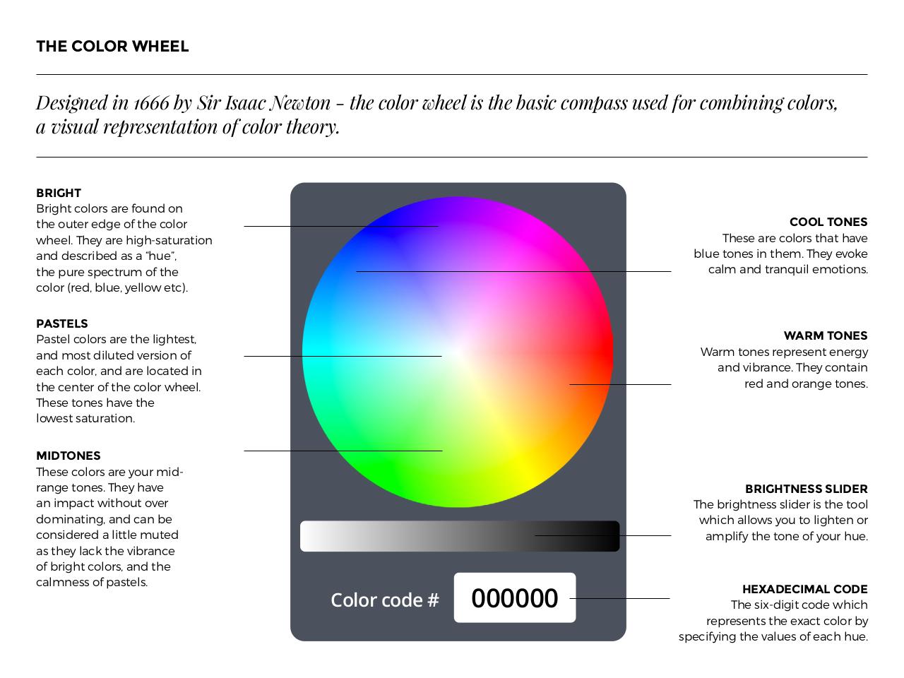
THE COLOR WHEEL
C(#"%/('$"/$LMMM$2-$>"1$N#33=$O().,/$E$.+($=,*,1$)+((*$"#$.+($23#"=$=,:<3##$&#('$0,1$=,:2"/"/%$=,*,1#P$
3$5"#&3*$1(<1(#(/.3.",/$,0$=,*,1$.+(,1-6
BRIGHT
Bright colors are found on
the outer edge of the color
wheel. They are high-saturation
and described as a “hue”,
the pure spectrum of the
color (red, blue, yellow etc).
COOL TONES
These are colors that have
blue tones in them. They evoke
calm and tranquil emotions.
PASTELS
Pastel colors are the lightest,
and most diluted version of
each color, and are located in
the center of the color wheel.
These tones have the
lowest saturation.
MIDTONES
These colors are your midrange tones. They have
an impact without over
dominating, and can be
considered a little muted
as they lack the vibrance
of bright colors, and the
calmness of pastels.
WARM TONES
Warm tones represent energy
and vibrance. They contain
red and orange tones.
BRIGHTNESS SLIDER
The brightness slider is the tool
which allows you to lighten or
amplify the tone of your hue.
Color code #
000000
HEXADECIMAL CODE
The six-digit code which
represents the exact color by
specifying the values of each hue.