How to design for your brand(1) .pdf
Nombre del archivo original: How-to-design-for-your-brand(1).pdf
Este documento en formato PDF 1.3 fue generado por Adobe InDesign CC 2014 (Macintosh) / Mac OS X 10.5.8 Quartz PDFContext, y fue enviado en caja-pdf.es el 13/07/2016 a las 13:47, desde la dirección IP 94.229.x.x.
La página de descarga de documentos ha sido vista 4913 veces.
Tamaño del archivo: 16.9 MB (36 páginas).
Privacidad: archivo público
Vista previa del documento
How To Design
For Your Brand
In Canva.
Poppie Pack
COMBINING
typefaces for impact
OVERVIEW
!"#$%&"'($)"**$#+,)$-,&$+,)$.,$'(#"%/$0,1$-,&1$
213/'$"/$43/536$7,&$)"**$*(31/$+,)$.,8
GET STARTED WITH CANVA
How Canva works as a platform. An introduction to using
Canva for your brand.
BRANDING ELEMENTS
Learn the key elements that make a consistent brand,
including colors, fonts, imagery and assets.
IMAGES + FILTERS
Create custom filters to give your images a unique edge.
Get started with our selection of pre-set options.
COLORS
Get inspiration from our beautiful collection of color
palettes and learn how to apply them to your own designs.
FONTS
One of the hardest parts of designing is pairing fonts. We
give you a headstart with great font pairs to use in Canva.
BRAND KITS
See how we’ve combined all the essential brand elements
to create three different case studies that’ll inspire you.
COLLECTION
OBJECTPRODUCT.COM/EDIBLE
RESOURCES
Create your own brand kit using our remixable templates.
We’ve also assembled a number of other resources.
INTRODUCTION
TO CANVA
9:3;"/%*-$#":<*($%13<+"=$'(#"%/6
Canva is a online design platform that makes it easy for
everybody to create beautiful graphics. You can design almost
anything in Canva; from social media graphics to posters, and
business cards to presentations.
>.31.$3$/()$'(#"%/$,/$.+($43/53$+,:(<3%($3/'$(3#"*-$3==(##$3**$,0$-,&1$(?"#."/%$'(#"%/#6$
Upload your own images or take advantage of Canva’s library
of more than 1 million stock images and elements.
Create your own design from scratch or customize the
beautiful layouts available in Canva. There are plenty of design
styles to choose from and it’s easy way to get started.
Create a new design at canva.com
4+,,#($01,:$.+,&#3/'#$,0$"/#<"13.",/3*$*3-,&.#$.,$@&"=A*-$%(.$#.31.('$)+(/$-,&B1($'(#"%/"/%6
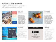
BRAND ELEMENTS
9<<*-$.+(#($0,&1$213/'"/%$(*(:(/.#$=,/#"#.(/.*-$.,$
-,&1$'(#"%/#$.,$=1(3.($3$&/"@&($213/'$#.-*(6
COLOR
IMAGES
One of the most
vital components
to graphic design
is color. Limit your
brand’s choice to 3-4
colors. Ensure you
have at least one
light and one dark
tone for contrast.
An image speaks
a thousand words.
Images are a great
way to reinforce your
style and visually
represent your brand
ideals. Images with
copy space will let
your text breathe.
FILTERS
LUMBERJACK
Filters are an excellent
way to give your
graphics a unique
E C O Nflavor.
O M I CApply
A B OaL D
consistent filter across
Use the typeface
Archivo
Narrow for
all of your
imagery
Regular
for your bodybrand
copy. style.
a cohesive
NO R W ES TER
OKTOBERFEST
BIG & BOLD
ANTON
SIX CAPS
Use the typeface Open Sans
for your body copy.
GRAND OPENING
FONTS
Pick 2-3 fonts for
your brand. Combine
contrasting fonts —
such as a sans serif
and a serif — for
maximum impact.
Canva has hundreds
of fonts to tailor to
suit your brand.
DESIGN IN
PRACTICE
The following section
will explain the different
components of designing for
your brand, from color and
typeface choices, to applying
consistent style filters
to all your imagery.
C(#"%/$"#$/,.$D&#.$)+3.$".$*,,A#$*"A($
3/'$0((*#$*"A(6$C(#"%/$"#$+,)$".$),1A#6
E$>.(5($F,2#
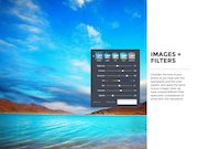
IMAGES +
FILTERS
Consider the tone of your
brand, as you have with the
typography and the color
palette, and apply the same
to your images. Here, we
have created different filter
styles with a breakdown of
what each one represents.
VINTAGE
‘70s-inspired photo filters are
in high demand. They echo
beaches, salty skin and general
summer bliss. In this image,
the brightness has been
decreased, to soften the blue
sky and create warmer tones.
Lowering the contrast takes
the edge off the hard gleam
in the palm tree. Adding a bit
of x-process, inflects green
tones into the sharp blue,
imitating an aged photograph.
Filter Code: 4653796466009a
VISTA
Make the still blue of lakes
and rivers gleam by increasing
contrast and saturation.
This helps the shadows
become more prominent
and separates the colors by
darkening specific hues
Filter Code: 5482a464661873
MONOCHROME
Get the full effect of shapes
and forms by applying
monochrome to your image.
This doesn’t necessarily mean
that you have to make it black
and white; monochrome
simply means shades of one
color. Toggle the contrast and
brightness sliders to achieve
the optimum effect for the
features within your image.
Filter Code: 42a50564480064
SHARPEN UP
Create detail and texture in
your image by decreasing the
blur. This is a great way to get
the full texture of elements in
your photo. The veins in the
leaves (often hindered by the
effects of a slow shutter speed)
are now brought to life.
Filter Code: 656565650b0064
CREATE CONTRAST
With objects that are textural,
such as twine and pine
cones, the contrast should
be increased to accent the
blends. This feature also
helps the layers of objects
offset each other by defining
the lightest and darkest
areas within your image. The
saturation in this image has
been adjusted to enhance the
natural hues in each object.
Filter Code: 77a06464640064
HIGH SATURATION
In food photography, keep your
objects luminous and intense
by increasing the saturation
and adjusting the x-process.
This will also help enhance the
separation between colors.
Filter Code: 64649264640064
FILTER TIP
G3A($.+($#."**$
2*&($,0$*3A(#$3/'$
1"5(1#$%*(3:$2-$
3<<*-"/%$=,/.13#.$
3/'$#3.&13.",/6$
!"#$+(*<#$.+($
#+3',)#$2(=,:($
:,1($<1,:"/(/.$3/'$
#(<313.(#$.+($=,*,1#$
2-$'31A(/"/%$
#<(="H=$+&(#6$
COLOR
How to create clever color
combinations for your brand
and apply them to your designs.
COLOR BREAKDOWN
I!($<&1(#.$3/'$:,#.$.+,&%+.0&*$:"/'#$31($.+,#($)+"=+$*,5($=,*,1$.+($:,#.6J$E$F,+/$K&#A"/
GREEN
Green traditionally
represents freshness and
the environment, a natural
color choice for any brands
related to the living world.
YELLOW
Yellow represents happiness
and joy. The warmth of this
color stimulates mental activity
and is said to capture more
attention than any other hue.
BLUE
Often used with technology
brands, the color blue is
associated with security, loyalty,
integrity and harmony.
ORANGE
Friendship and adventure are
represented by the color orange.
You will notice that a common
visual representation of sports
will include something orange.
RED
Passion, emergency, sexuality
and lust are the emotions
most often associated with the
color red. In eastern cultures,
red is the color of good luck.
PINK
Romance and love are celebrated
in pink, this hue also relates
to nurturing and compassion.
It is known to bring out the
empathetic qualities in people.
PURPLE
Purple stands for
independence, individuality
and inspiration. You will see
this color used to represent
spirituality and magic.
GRAY
They say this tone is known
as impartial, being not one or
the other. It’s commonly used
as a neutral color that has no
major emotion attached to it.
THE COLOR WHEEL
C(#"%/('$"/$LMMM$2-$>"1$N#33=$O().,/$E$.+($=,*,1$)+((*$"#$.+($23#"=$=,:<3##$&#('$0,1$=,:2"/"/%$=,*,1#P$
3$5"#&3*$1(<1(#(/.3.",/$,0$=,*,1$.+(,1-6
BRIGHT
Bright colors are found on
the outer edge of the color
wheel. They are high-saturation
and described as a “hue”,
the pure spectrum of the
color (red, blue, yellow etc).
COOL TONES
These are colors that have
blue tones in them. They evoke
calm and tranquil emotions.
PASTELS
Pastel colors are the lightest,
and most diluted version of
each color, and are located in
the center of the color wheel.
These tones have the
lowest saturation.
MIDTONES
These colors are your midrange tones. They have
an impact without over
dominating, and can be
considered a little muted
as they lack the vibrance
of bright colors, and the
calmness of pastels.
WARM TONES
Warm tones represent energy
and vibrance. They contain
red and orange tones.
BRIGHTNESS SLIDER
The brightness slider is the tool
which allows you to lighten or
amplify the tone of your hue.
Color code #
000000
HEXADECIMAL CODE
The six-digit code which
represents the exact color by
specifying the values of each hue.
COLOR GROUPS
ANALOGOUS
SPLIT COMPLEMENTARY
MONOCHROMATIC
Choosing colors has some
science to it. Here is a
breakdown of some of the
main color groups, and how
they are established based
on their location within the
color wheel. Remember
this is a guide; the best
way to find colors is to
experiment with different
palettes and combinations.
These colors sit next to each
other on the color wheel.
Because they are so similar
in hue, create contrast by
using different tones.
This group is easier to work
with than complementary
colors. It is made up of two
similar colors along with
one contrasting hue.
COMPLEMENTARY
TRIAD
A monochromatic color palette
is when all shades are of the
same color. It is commonly
misrepresented as tones of
gray, however its true definition
is tones of the same hue.
These colors are opposite
each other on the color wheel.
This high contrast application
creates a vibrant pairing
and a strong visual effect.
Colors that sit in an even triangle
across the color wheel are the
triad group. A successful balance
of these hues is when one color
dominates over the other two.
I!(1($31($=,*,1#$)+"=+$=3&#($(3=+$,.+(1$.,$#+"/($21"**"3/.*-P$)+"=+$0,1:$3$=,&<*($)+"=+$=,:<*(.($(3=+$
,.+(1$*"A($:3/$3/'$),:3/6J$E$Q"/=(/.$53/$R,%+
9/3*,%,&#
4,:<*(:(/.31-
><*".$4,:<*(:(/.31-
S1"3'
G,/,=+1,:3."=
CHOOSING BRAND COLORS
Choosing the right colors for your
brand might seem like a daunting
exercise. Find out which colors
represent your industry
or reflect the emotion you
want your brand to convey.
Experiment by playing around
with different schemes by
plucking hues from photos, and
creating mood-boards to see how
the colors work together, or don’t.
Try creating a template with a
photo grid. Insert images with
interesting colors and collect the
dominant hues you like from the
photograph to form a palette. It’s
important to ensure you choose a
collection of colors with enough
contrast so that they will
work well when applied
as backgrounds, elements
and overlaying type.
4,*,1$=,:2"/3.",/#$=3/$=,:($01,:$3/-)+(1(P$01,:$.+($.,/(#$"/$/3.&1(P$.,$.+($03=3'(#$,0$2&"*'"/%#6$
T#($3$=,*,1$'1,<<(1$.,,*$.,$=1(3.($#,:($2(3&."0&*$<3*(..(#$,0$-,&1$,)/6$U(1($)($+35($=,**3.('$#,:($
/"=($,<.",/#$.,$"/#<"1($-,&6$
COMBINING
typefaces for impact
FONTS
How to create and apply
effective font combinations
to develop a typographic
style for your brand.
FONT PAIRING
S-<(03=(#$+35($<(1#,/3*".-$.,,6$C"V(1(/.$.-<(03=(#$#-:2,*";($:,,'#6$!(1(0,1(P$.+($0,/.#$-,&$=+,,#($
#+,&*'$1(<1(#(/.$-,&1$2&#"/(##P$2(=,:"/%$3$5"#&3*$0,,.<1"/.$0,1$-,&1$213/'6$
Typography is one of the most
interesting and exciting parts of
graphic design. Different typefaces
represent different personalities,
so the ones you choose to for
your business will create a visual
footprint for your brand.
Just as certain colors work well
together, there is a science
behind font pairing also. Some
type combinations work better
together than others. A sans
serif and serif pairing is a nice
option, as the opposing styles
will create pleasing contrast.
You can use a more detailed or
elaborate typeface (like Sifonn or
Sacramento) as a header, these
are often called display fonts.
Remember, you don’t have to
use different typefaces to get a
dramatic effect: use light, bold
and italic versions from the
same family for versatility.
LUMBERJACK
BIG & BOLD
N OR WES TER
ANTON
ECONOMICA BOLD
Use the typeface Archivo Narrow
Regular for your body copy.
OKTOBERFEST
SIX CAPS
Use the typeface Open Sans
for your body copy.
GRAND OPENING
GERMANIA ONE
HAMMERSMITH ONE
ROBOTO CONDENSED
Use the typeface Lora Regular
for your body copy.
Quattrocento
QUANDO
FONT PAIRING
Use Quattrocento for
your body copy.
GELATO BAR
OSWALD BOLD
OSWALD REGULAR
Use Archivo Narrow for
your body copy.
GEOMETRIC
Yellowtail
E C O NO M IC A BO LD
ARVO
COUSTARD
Use Sanchez Regular
for your body copy.
OSWALD BOLD
OSWALD REGULAR
Use Archivo Narrow for
your body copy.
FRENCH BAKERY
1940
GELATO BAR
COCKTAIL HOUR
GEOMETRIC
Parisienne
Sacremento
Yellowtail
Mr Dafoe
Use the typeface Josefin Sans
Use Raleway Regular
Regular for your body copy.
for your body copy.
Use the typeface Roboto
for your body copy.
RALEWAY REGULAR
Use Libre Baskerville
for your body copy.
ORGANIC PRODUCE
Quattrocento
Use Quattrocento for
your body copy.
Use Raleway Regular
for your body copy.
Abril Fatface
CONDENSED
QUANDO
RALEWAY REGULAR
MAGAZINE
ENGAGEMENT
FASHION
BODONI BOLD
Bodoni Italic
Use Quattrocento Regular
for your body copy.
PERFUMERIE
ROBOTO REGULAR
INDUSTRIAL
LIBRE
BASKERVILLE
Libre Baskerville Italic
Use the typeface Libre Baskerville
for your body copy.
ROBOTO CONDENSED
C(#"%/$=3/$2($31.6$C(#"%/$=3/$2($3(#.+(."=#6$
C(#"%/$"#$#,$#":<*(P$.+3.B#$)+-$".$"#$#,$=,:<*"=3.('6
$E$W3&*$K3/'
CASE STUDY
SECTION
Now that we’ve demonstrated
the elements that make up
a brand’s identity, we will run
through four case studies.
They have been created in
Canva to show how to easily
implement a style guide.
CASE
STUDY
ONE
X2D(=.$W1,'&=.$E$
U,:($)31($4,:<3/-
GUIDELINES
We’ve created Object
Product, a home-wares
and product company that
sells Scandinavian style
furniture and objects. They’ve
distinguished themselves for
their beautiful and functional
Nordic products. Given this cool
and calm aesthetic, the strategy
behind OP is to create a stylish
and easy shopping experience.
THE LOGO
THE COLOR PALETTE
The geometric monogram
inside the circle is a typical
minimalistic symbol, which is
part of the Scandinavian style.
The O and P have been tightened
together using letter spacing
to symbolize the way furniture
and items in a house combine
to make a home. Enclosing your
logo inside a shape is extremely
functional. It means you are
able to place it with ease no
matter what the background.
Colors can produce an emotional
response, therefore the colors
you choose for your products
should be selected with care.
The palette below has outlined
a rationale behind the color
choice of each category.
This home ware company has
color coded its category sections
to easily identify with their
audience what each piece of
marketing material is about.
4,*,1#$=3/$<1,'&=($3/$(:,.",/3*$1(#<,/#(P$.+(1(0,1($.+($=,*,1#$-,&$=+,,#($0,1$-,&1$<1,'&=.#$#+,&*'$2($
#(*(=.('$)".+$=31(6$
COLOR PALETTE
LOGO
PLANTATION
GENERIC
PLANTATION
CRAFTING
EDIBLE
The logo is used in color variants based on category.
Plantation collection.
Plantation green is used
to celebrate all plants
and items made of
plant materials.
CRAFTING
EDIBLE
Crafting collection.
This category encompasses
all items containing paper
and crafting materials.
The edible collection.
Blue is the color chosen to
represent all the culinary
and food associated
brand category.
THE IMAGES
THE TYPOGRAPHY
The font combination chosen
for this brand is Sifonn and
Josefin Sans, both art-deco style
sans serifs. The clean and sharp
edges of the typefaces represent
the equally crisp edges and
structure of the products sold
at Object Product, while also
fitting with its contemporary
aesthetic. Sifonn, with its heavier
weight, is a suitable typeface
for headings and call to action
messaging. Josefin Sans is a
finer font, and works well for
body copy and subheadings.
The filter used for Object
Product is low contrast and
high saturation. This creates a
shallow depth of field, making
the objects in the image seem
flat, allowing the photograph to
act as a background. Another
vital component to all the
photographs used is that it
has been shot from a bird’s
eye view (flat high angle), to
showcase the products laying
flat. This also creates a more
one dimensional effect which
better acts as a background
than angled photographs.
9/,.+(1$5".3*$=,:<,/(/.$.,$3**$.+($<+,.,%13<+-$&#('$"#$.+3.$".$+3#$2((/$#+,.$01,:$3$2"1'B#$(-($5"()$
YZ3.$+"%+$3/%*([P$.,$#+,)=3#($.+($<1,'&=.#$*3-"/%$Z3.6
IMAGERY
TYPOGRAPHY
Primary Typeface
TREATMENT
Sifonn to be used for title and headings.
J O S E F I N S A N S ( B O L D )
SUBHEADINGS
Secondary Typeface 1
Josefin Sans Bold caps to be
used for all subheadings.
J O S E F I N S A N S
Bodycopy
Secondary Typeface 2
Josefin Sans Bold caps to be
used for all bodycopy.
FILTER CODE: 7E32A764640075
This filter is low contrast and high saturation. The benefit of this is that it creates a shallow depth of field,
allowing the imagery to act as a flatter style background but keeping the colors strong and warm.
N.#$S)"..(1$<,#.#$&#($3$=,*,1$,5(1*3-$,/$.,<$,0$.+($
23=A%1,&/'$":3%($)+"=+$+(*<#$.+($=,**(=.",/$
=3.(%,1-$#.3/'$,&.$3/'$(/+3/=(#$.+($)+".($.-<(6
COLLECTION
OBJECTPRODUCT.COM/EDIBLE
\(0.8$9$S)"..(1$<,#.$"/$3=.",/6$K"%+.8$!1(($'"V(1(/.$<,#.#$&#"/%$'"V(1(/.$=3.(%,1-$=,*,1#$3/'$":3%(1-6
Object Product has used the
color overlay effect for their social
media posts. This application
serves the minimal text on
these graphics. It offsets well
the background from the
type and allows the category
name to be full focus.
SIGNAGE
HOW BRAND IDENTITY IS IMPLEMENTED IN A STORE.
CASE
STUDY
TWO
]('/(#'3-$0,1$]"#+(#$
E$4+31".-$^,&/'3.",/
Wednesday for Wishes is
a charity foundation that
supports less privileged
children. Every child brought
up in a loving home with the
luxuries of choice has wishes
granted, but the same is not
said for those less fortunate.
Wednesday for Wishes raises
money to help grant the wishes
of children that are orphaned,
homeless or unwell. It is a
humanity focused not-for-profit
with a dream for a better world.
THE LOGO
The “Ribbon of Infinity” has been
created to represent the idea that
a wish does not go away until it is
granted. Both ends of the ribbon
get smaller, but one always sits off
THE TYPOGRAPHY
the page as if never ending.
The logo can be used in any of
the brand colors but
always at 80% opacity.
Montserrat has been chosen as
the brand typeface. It’s a very
neutral and unpretentious sans
serif that is easy to read and
stands out well when scaled.
There are three weights that
are applied to different parts
of text, and all copy is placed
in lowercase, this is the brand
making a statement. This choice
represents their lack of interest in
hierarchy or levels of importance,
only their brand mission.
C(#"%/$"#$"/$(5(1-.+"/%$)($:3A(P$2&.$".B#$3*#,$2(.)((/$.+,#($.+"/%#6$N.B#$3$:"?$,0$=130.P$#="(/=(P$#.,1-.(**"/%P$
<1,<3%3/'3P$3/'$<+"*,#,<+-6$_$`1"A$9'"%31'
COLOR PALETTE
The Wednesday for Wishes
foundation has a soothing
palette made up of soft colors.
These colors have been muted
with a subtle transparency to
THE IMAGES
represent the opaque thistles
of a dandelion. The dandelion
is a common symbol within
brand imagery and is associated
with making a wish.
The image style chosen for
Wednesday for Wishes is made
up of decreased brightness,
a purple tint and heavy
x-processing. The combination
of these effects makes for a soft
and whimsical effect. In terms
of the content, Wednesday for
Wishes choose wild dandelions
as a theme in marketing material,
as they are synonymous with
the analogy of wishes. There
is also a subtle transparency
applied to the images to enhance
style and tone of the brand.
]('/(#'3-$0,1$]"#+(#$=+,,#($)"*'$'3/'(*",/#$3#$3$.+(:($"/$.+("1$:31A(."/%$:3.(1"3*$3#$.+(-$31($
#-/,/-:,&#$)".+$.+($3/3*,%-$,0$)"#+(#6$!(1($"#$3*#,$3$#&2.*($.13/#<31(/=-$3<<*"('$.,$.+($":3%(#$.,$
(/+3/=($.+($)+":#"=3*$.,/(6
DESIGN IN PRACTICE
Here is a collection of Wednesday
for Wishes collateral. The poster
has more detailed information
in order to drive potential new
supporters. From a design
perspective, you will see that
the text wraps around the
dandelion for emphasis.
The social media posts take a
more simplistic approach. It’s vital
to include your tag-line and a
call to action within your graphic.
^1,:$.,<$*(0.8$W,#.(1P$>,="3*$G('"3$W,#.#$3/'$^3=(2,,A$4,5(16
If you are creating a Facebook
Cover or Twitter Header, there is
an avatar on the left hand side.
It’s important to compose your
design to the left as opposed to
the other graphics which have
been right aligned. The logo is
already in your profile picture,
so it isn’t necessary to include
it in the design of your cover.
CASE
STUDY
THREE
X1=+31'$E$
^1(#+$W1,'&=(
The McGrath family has
been building Orchard, their
fresh foods company, for
57 years. They deliver consistent
quality to their customers, and
continue to improve season
to season. Orchard uses no
pesticides or genetic enhancers
on their produce. They pride
themselves on their organic
methods, from the growth
of its fruit and vegetables to
their packaging and delivery.
The “Paper Bag Promise” of
100% natural food that was
installed by the Orchard
pioneer still lives today.
THE LOGO
The team at Orchard are firm
believers in “you are what you eat”.
Orchard’s logo is symmetrical,
representing the natural balance
and order that’s found in nature.
The logo serves as a guarantee to
THE COLORS
customers that the company is
committed to supplying food in
its most natural form. Orchard will
nourish and connect your family
with the goodness of the earth.
Because Orchard doesn’t
believe in artificial adjustments
or modifications, the same
rules apply to their branding.
Therefore, the colors chosen
for their color palette are tones
drawn from the first products
that original founder, Terry
McGrath grew: blueberries,
pumpkins and eggplant.
X1=+31'B#$*,%,$"#$#-::(.1"=3*P$1(<1(#(/."/%$.+($/3.&13*$23*3/=($3/'$,1'(1$.+3.B#$0,&/'$"/$/3.&1(6$
THE TYPOGRAPHY
Orchard uses two typefaces:
Raleway Heavy and Source
Sans Pro. Raleway Heavy, with
its bold and geometric style,
is used for titles and headings.
THE IMAGES
Source Sans Pro has been chosen
as a secondary typeface for its
easy-to-read quality. An added
benefit is how its narrow form
contrasts nicely with Raleway.
The filters used for Orchard’s
imagery are slightly desaturated,
suggesting that the products
are free of genetic modifications.
fruits and vegetables. This finish
gives the content an organic and
untouched feel. Increasing the
brightness enhances the element
of freshness. Adjusting the
brightness also ensures that when
the dark color overlay is applied
the produce doesn’t get lost.
!($H*.(1#$&#('$0,1$X1=+31'B#$":3%(1-$31($#*"%+.*-$'(#3.&13.('P$#&%%(#."/%$.+3.$.+($<1,'&=.#$31($01(($,0$
%(/(."=$:,'"H=3.",/#6$01&".#$3/'$5(%(.32*(#6$
RALEWAY HEAVY
Mr Dafoe
ORCHARD
!($.(3:$3.$X1=+31'$
,V(1$)((A(/'$.,&1#$
31,&/'$.+($031:$.,$
('&=3.($<(,<*($,/$.+($
":<,1.3/=($,0$,1%3/"=$
+,1."=&*.&1(6$X1=+31'B#$
^3=(2,,A$<3%($"#$&#('$
3#$3$1(#,&1=($0,1$0,**,)$
&<$"/0,1:3.",/6$
W,#.(1#$'(#"%/('$.,$=(*(213.($#(3#,/3*$01&".$
&#"/%$.+($0(3.&1($.-<(03=(P$G1$C30,(6
!($IW3<(1$a3%$W1,:"#(J$,0$Lbbc$/3.&13*$0,,'$
.+3.$)3#$0,1%('$2-$.+($X1=+31'$<",/((1#$#."**$
*"5(#$,/$.,'3-6$
Orchard’s social media space is
utilized as an educational forum
to encourage customers to learn
about the health benefits of the
different fruit and vegetables
sold at the market. This is also
an excellent learning portal for
children. There are printable
fact cards, and on weekends
there are guides who offer
tours on the farm educating
people on the importance
of organic horticulture.
^1,:$.,<$*(0.8$W1"/.32*($03=.$=31'#P$.+($X1=+31'$^3=(2,,A$W3%($0(3.&1"/%$=,5(1$":3%($3/'$<1,H*($<"=.&1(6
RESOURCES SECTION
CANVA REMIX LINKS TO START YOUR OWN BRANDING JOURNEY.
Click on these images to create
and save your own version of all
the brilliant designs you have
seen in this book. Adjust the
designs as you please, create
new color palettes and challenge
your type combinations using
these useful templates.
4,*,1$<3*(..(
W,#.(1
^3=.$%13<+"=#
X1=+31'$#.-*(%&"'(
X2D(=.$W1,'&=.$#.-*(%&"'(
]('/(#'3-$0,1$]"#+(#$#.-*(%&"'(
S)"..(1$%13<+"=#
C"3%13:$*3-,&.
THE DESIGN
SCHOOL
7,&1$/&:2(1$,/($#,&1=($0,1$
'(#"%/$"/#<"13.",/6
Get daily design inspiration at Canva’s
Design School. Learn the fundamentals
of design with our series of 30 interactive
tutorials, or read our latest blog articles.
designschool.canva.com
START
DESIGNING
TODAY!
W&.$3**$.+($."<#$-,&B5($
*(31/('$"/.,$<13=."=(6
Sign up to Canva today to
access all these amazing
resources and start your
design journey!
www.canva.com
Descargar el documento (PDF)
How-to-design-for-your-brand(1).pdf (PDF, 16.9 MB)
Documentos relacionados
Palabras claves relacionadas
brand
canva
design
regular
their
contrast
colors
create
these
style
images
tones
color
filter
typeface

