How to design for your brand(1).pdf
Vista previa de texto
THE TYPOGRAPHY
Orchard uses two typefaces:
Raleway Heavy and Source
Sans Pro. Raleway Heavy, with
its bold and geometric style,
is used for titles and headings.
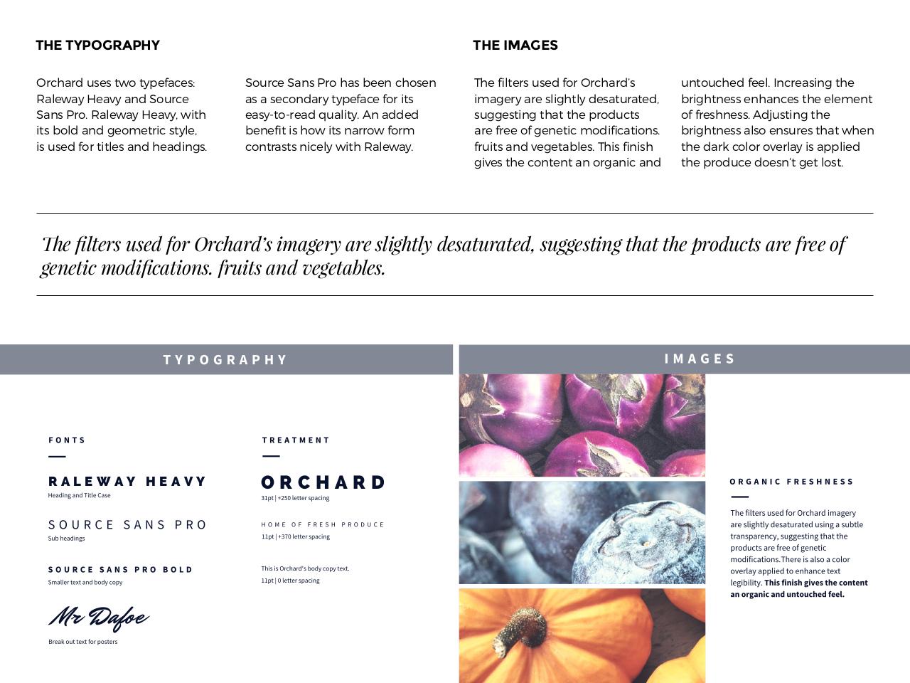
THE IMAGES
Source Sans Pro has been chosen
as a secondary typeface for its
easy-to-read quality. An added
benefit is how its narrow form
contrasts nicely with Raleway.
The filters used for Orchard’s
imagery are slightly desaturated,
suggesting that the products
are free of genetic modifications.
fruits and vegetables. This finish
gives the content an organic and
untouched feel. Increasing the
brightness enhances the element
of freshness. Adjusting the
brightness also ensures that when
the dark color overlay is applied
the produce doesn’t get lost.
!($H*.(1#$&#('$0,1$X1=+31'B#$":3%(1-$31($#*"%+.*-$'(#3.&13.('P$#&%%(#."/%$.+3.$.+($<1,'&=.#$31($01(($,0$
%(/(."=$:,'"H=3.",/#6$01&".#$3/'$5(%(.32*(#6$
RALEWAY HEAVY
Mr Dafoe
ORCHARD