How to design for your brand(1).pdf
Vista previa de texto
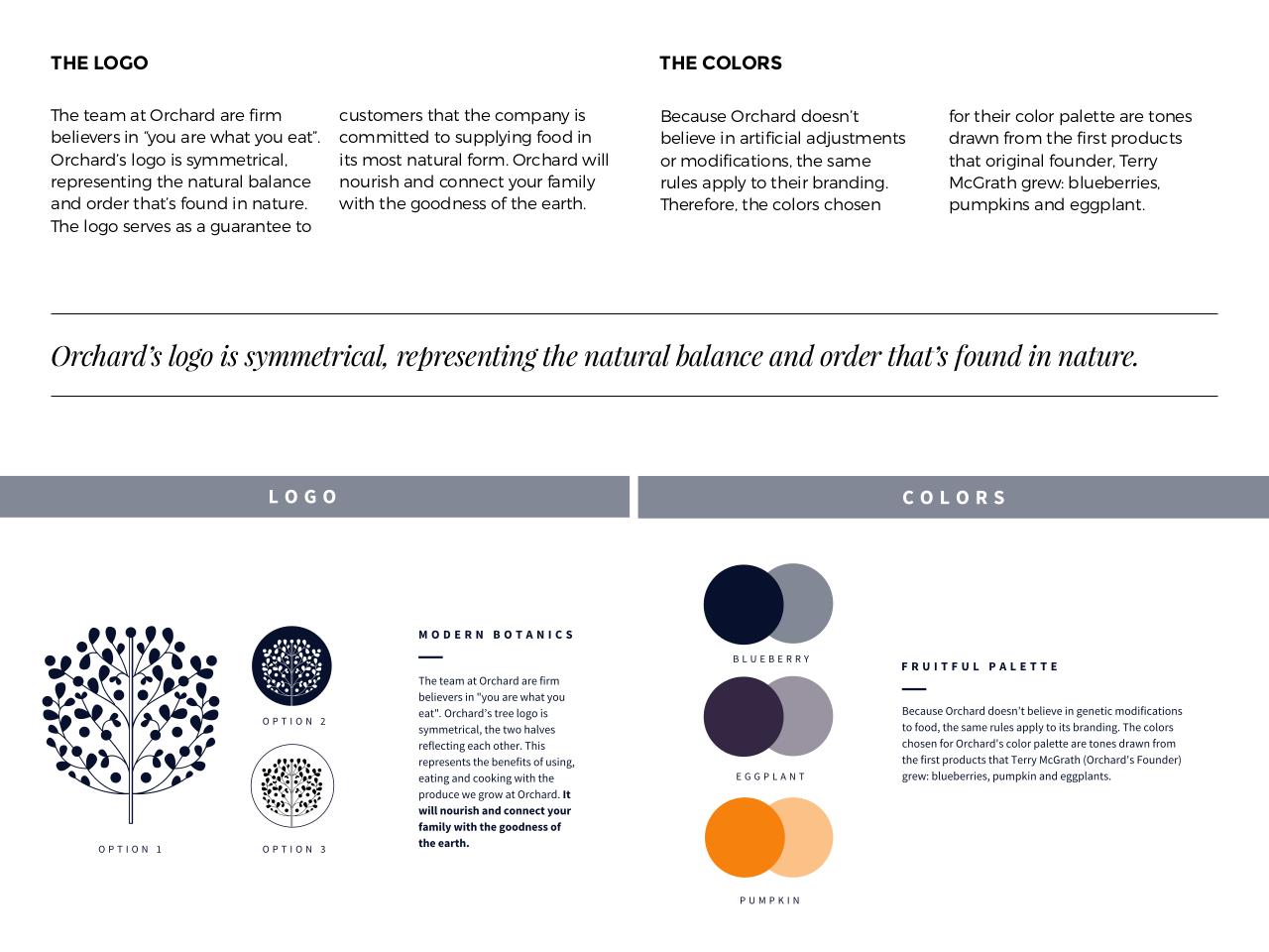
THE LOGO
The team at Orchard are firm
believers in “you are what you eat”.
Orchard’s logo is symmetrical,
representing the natural balance
and order that’s found in nature.
The logo serves as a guarantee to
THE COLORS
customers that the company is
committed to supplying food in
its most natural form. Orchard will
nourish and connect your family
with the goodness of the earth.
Because Orchard doesn’t
believe in artificial adjustments
or modifications, the same
rules apply to their branding.
Therefore, the colors chosen
for their color palette are tones
drawn from the first products
that original founder, Terry
McGrath grew: blueberries,
pumpkins and eggplant.
X1=+31'B#$*,%,$"#$#-::(.1"=3*P$1(<1(#(/."/%$.+($/3.&13*$23*3/=($3/'$,1'(1$.+3.B#$0,&/'$"/$/3.&1(6$