How to design for your brand(1).pdf
Vista previa de texto
THE IMAGES
THE TYPOGRAPHY
The font combination chosen
for this brand is Sifonn and
Josefin Sans, both art-deco style
sans serifs. The clean and sharp
edges of the typefaces represent
the equally crisp edges and
structure of the products sold
at Object Product, while also
fitting with its contemporary
aesthetic. Sifonn, with its heavier
weight, is a suitable typeface
for headings and call to action
messaging. Josefin Sans is a
finer font, and works well for
body copy and subheadings.
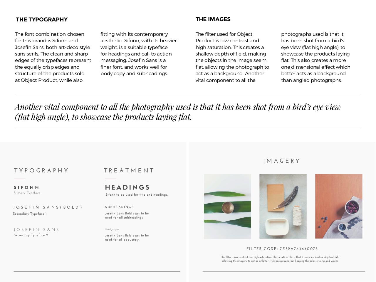
The filter used for Object
Product is low contrast and
high saturation. This creates a
shallow depth of field, making
the objects in the image seem
flat, allowing the photograph to
act as a background. Another
vital component to all the
photographs used is that it
has been shot from a bird’s
eye view (flat high angle), to
showcase the products laying
flat. This also creates a more
one dimensional effect which
better acts as a background
than angled photographs.
9/,.+(1$5".3*$=,:<,/(/.$.,$3**$.+($<+,.,%13<+-$&#('$"#$.+3.$".$+3#$2((/$#+,.$01,:$3$2"1'B#$(-($5"()$
YZ3.$+"%+$3/%*([P$.,$#+,)=3#($.+($<1,'&=.#$*3-"/%$Z3.6
IMAGERY
TYPOGRAPHY
Primary Typeface
TREATMENT
Sifonn to be used for title and headings.
J O S E F I N S A N S ( B O L D )
SUBHEADINGS
Secondary Typeface 1
Josefin Sans Bold caps to be
used for all subheadings.
J O S E F I N S A N S
Bodycopy
Secondary Typeface 2
Josefin Sans Bold caps to be
used for all bodycopy.
FILTER CODE: 7E32A764640075
This filter is low contrast and high saturation. The benefit of this is that it creates a shallow depth of field,
allowing the imagery to act as a flatter style background but keeping the colors strong and warm.