How to design for your brand(1).pdf
Vista previa de texto
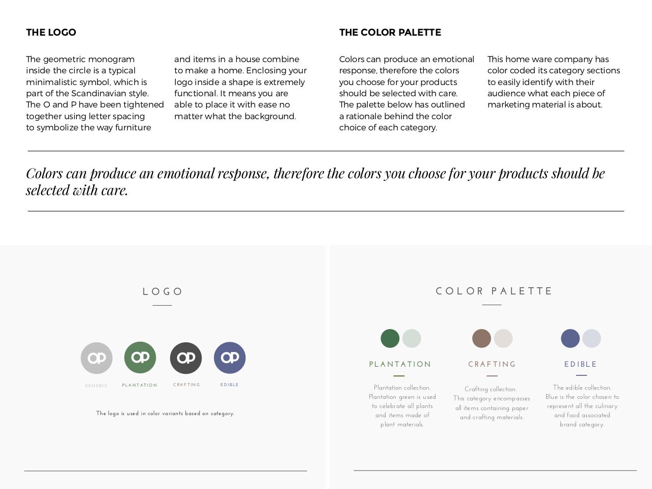
THE LOGO
THE COLOR PALETTE
The geometric monogram
inside the circle is a typical
minimalistic symbol, which is
part of the Scandinavian style.
The O and P have been tightened
together using letter spacing
to symbolize the way furniture
and items in a house combine
to make a home. Enclosing your
logo inside a shape is extremely
functional. It means you are
able to place it with ease no
matter what the background.
Colors can produce an emotional
response, therefore the colors
you choose for your products
should be selected with care.
The palette below has outlined
a rationale behind the color
choice of each category.
This home ware company has
color coded its category sections
to easily identify with their
audience what each piece of
marketing material is about.
4,*,1#$=3/$<1,'&=($3/$(:,.",/3*$1(#<,/#(P$.+(1(0,1($.+($=,*,1#$-,&$=+,,#($0,1$-,&1$<1,'&=.#$#+,&*'$2($
#(*(=.('$)".+$=31(6$
COLOR PALETTE
LOGO
PLANTATION
GENERIC
PLANTATION
CRAFTING
EDIBLE
The logo is used in color variants based on category.
Plantation collection.
Plantation green is used
to celebrate all plants
and items made of
plant materials.
CRAFTING
EDIBLE
Crafting collection.
This category encompasses
all items containing paper
and crafting materials.
The edible collection.
Blue is the color chosen to
represent all the culinary
and food associated
brand category.